Elevating Rached's Personal
Branding

Discover the transformative journey of Rached, a Business Consultant & Executive Coach, as we delve into The Shiny Creatives’ collaboration in crafting his unique personal brand.

The Challenge

Establish a distinct personal brand that not only reflects Rached's multicultural background but also effectively communicates his expertise and inclusivity across different languages and cultures.

Our Approach

We developed a branding strategy centered around a customized logo design that seamlessly integrated Arabic and French scripts.We also expanded Rached's brand to his podcast to enhance brand visibility.

The Solution

The result was a transformative branding solution that captured the essence of Rached's multicultural identity and reinforced his brand values of inclusivity and openness.

Visual Identity Design

Join us as we delve into the creative solutions that led to the creation
of Rached’s powerful personal identity.

Logo Explanation

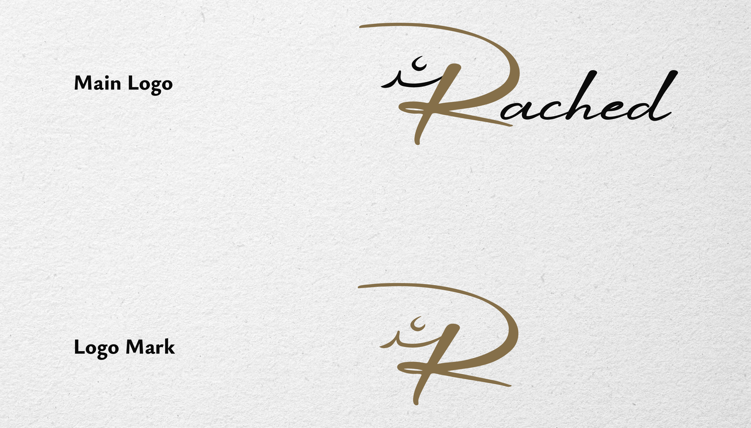
The logo for Rached’s personal brand elegantly presents his name in both Arabic and Latin scripts, reflecting his diverse cultural heritage and linguistic proficiency.

The centerpiece of the logo is the customized letter “R”
which harmoniously integrates elements from both scripts “R + ﺭﺍ”.

Logo Mark

The logo mark for Rached’s personal brand features the personalized letter “R,” seamlessly integrating the rest of his name in Arabic.
This addition maintains consistency with the primary logo while emphasizing the brand’s versatility and universality.

 

Typography

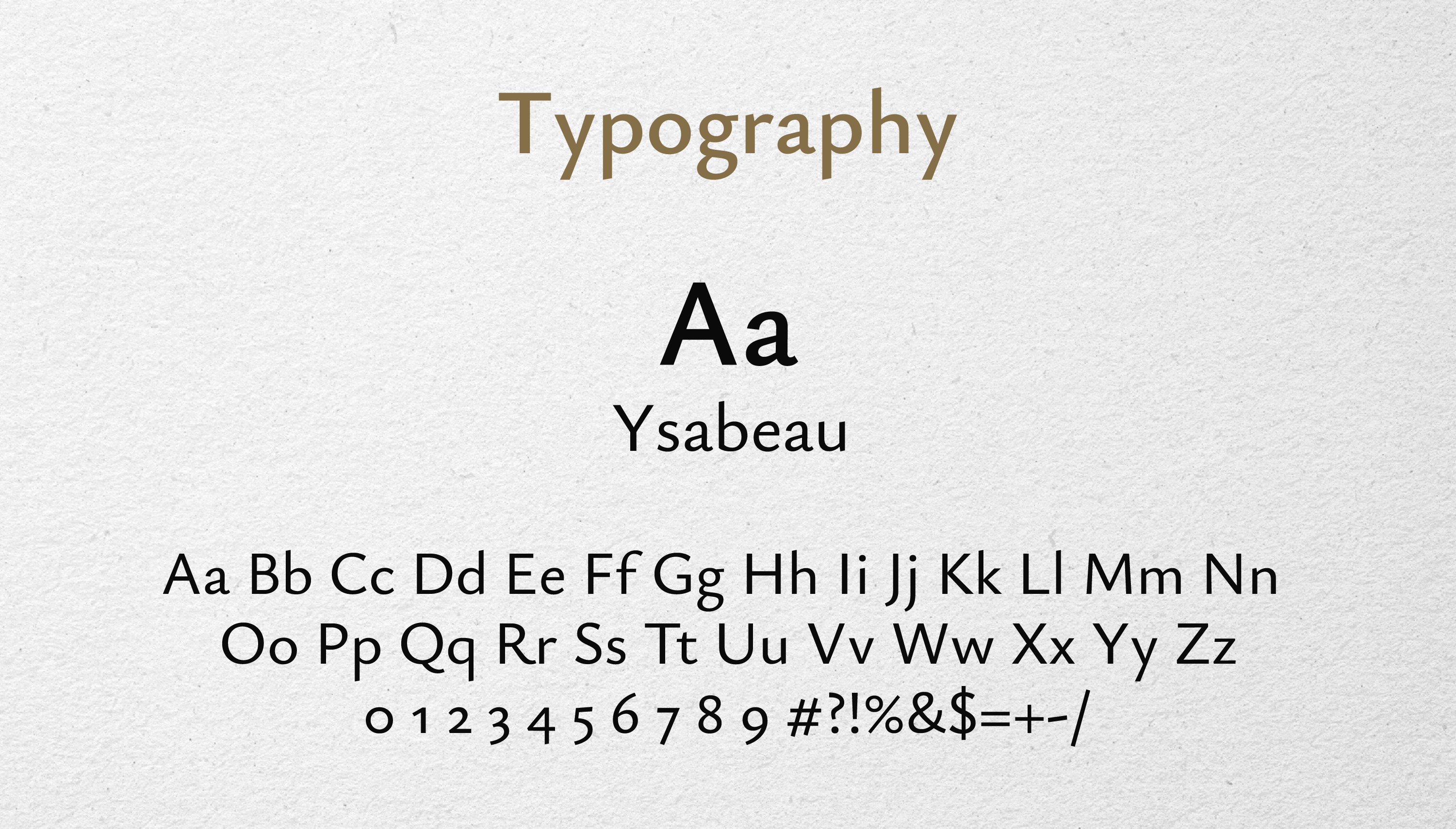
For Rached’s visual identity, we selected the Ysabeau typeface due to its contemporary elegance and exceptional readability across both print and digital platforms.

This typeface stands out with its clear, well-balanced forms that mirror the professionalism and clarity Rached brings to his consultancy work.

The subtle uniqueness of Ysabeau supports the brand’s core values of adaptability and versatility, making it an ideal choice for communicating effectively in a multi-lingual setting.

Color Palette

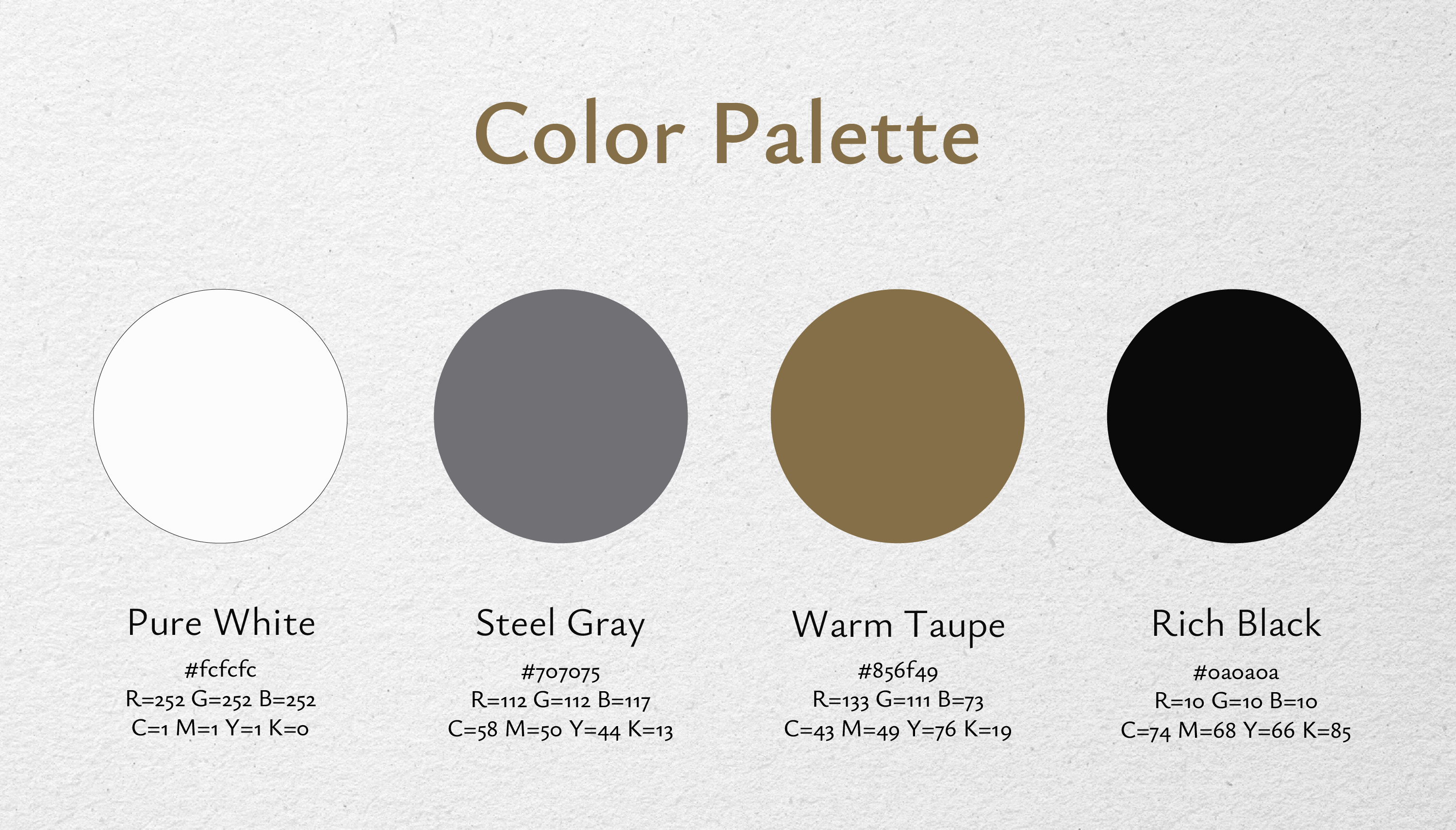
The color palette chosen for Rached’s brand is deeply symbolic and strategically chosen to enhance his brand’s visual impact.

Rich Black: represents sophistication and decisiveness.

Pure White: offers a clean, modern backdrop that speaks to clarity and precision.

Steel Gray: bridges the first two with its neutral, balanced tone, embodying the harmony between tradition and innovation.

Warm Taupe: introduces a touch of warmth and rootedness, reflecting the brand’s commitment to enduring values and connection.


Rached Podcast Logo

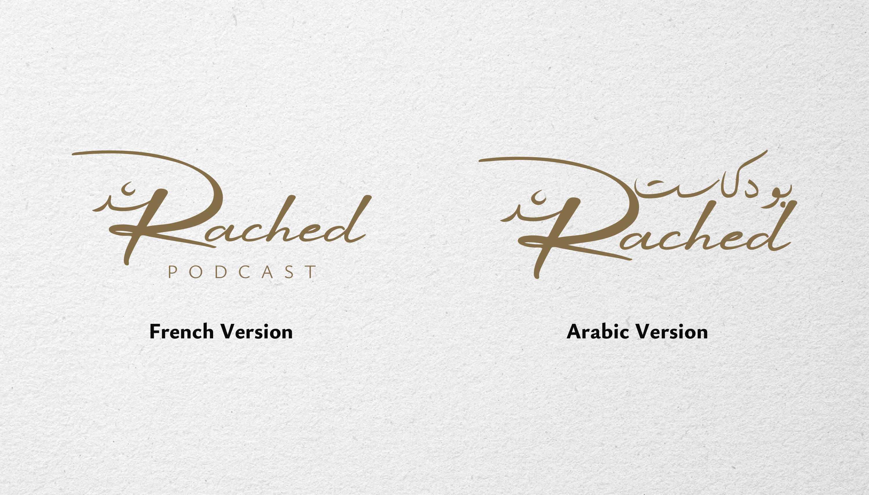
To enhance Rached’s brand presence online, we crafted a distinct podcast logo, aligning it with his core visual identity.

By integrating “podcast” beneath the main logo, we achieved a cohesive look that not only strengthens brand recognition but also emphasizes his engagement in digital media.

This strategic design choice effectively positions Rached’s brand to connect with a wider digital audience, optimizing his visibility across various platforms.

Applications and Collateral

Discover the Brand in Action!

Ready to Elevate Your Identity?

If you’re seeking to elevate your personal or business identity, our expertise in branding can help you craft a visual representation that truly reflects who you are. 

Contact Us

(+216) 24 383 957  contact@theshinycreatives.com