Transforming Healthcare Training:
A Branding Case Study

This case study takes you through the transformative journey of IMTIRAS, a pioneering health tech startup
dedicated to reshaping medical education through an innovative simulation app.

The Challenge

Establish a brand identity that not only stood out but also resonated with healthcare professionals seeking cutting-edge educational tools.

Our Approach

Through workshops and extensive research, we identified key brand attributes, laying the foundation for a strategic and creative brand development journey.

The Solution

Craft a distinctive logo that ingeniously captures the essence of medical simulation, and develop an impactful visual identity that authentically reflects the brand's values and personality.

Brand Identity Design

Join us as we delve into the creative solutions that led to the creation
of a powerful brand identity for IMTIRAS.

Logo Design

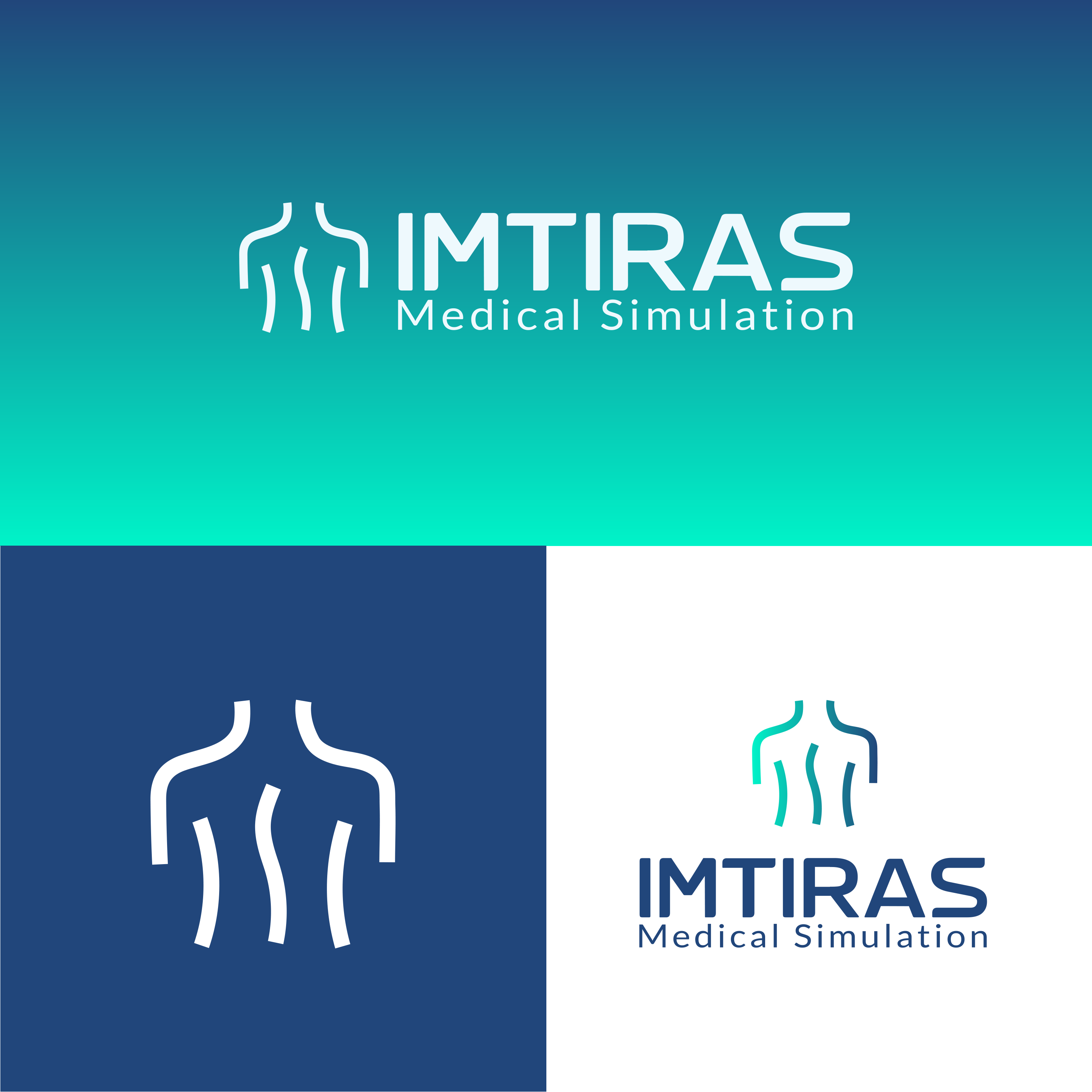
The final logo features a human silhouette. Upon closer inspection, the silhouette reveals an “M” and “S,” ingeniously constituting the body of the figure. This design choice elevates the logo beyond representation, embedding the very essence of Medical Simulation within its core.

Typography

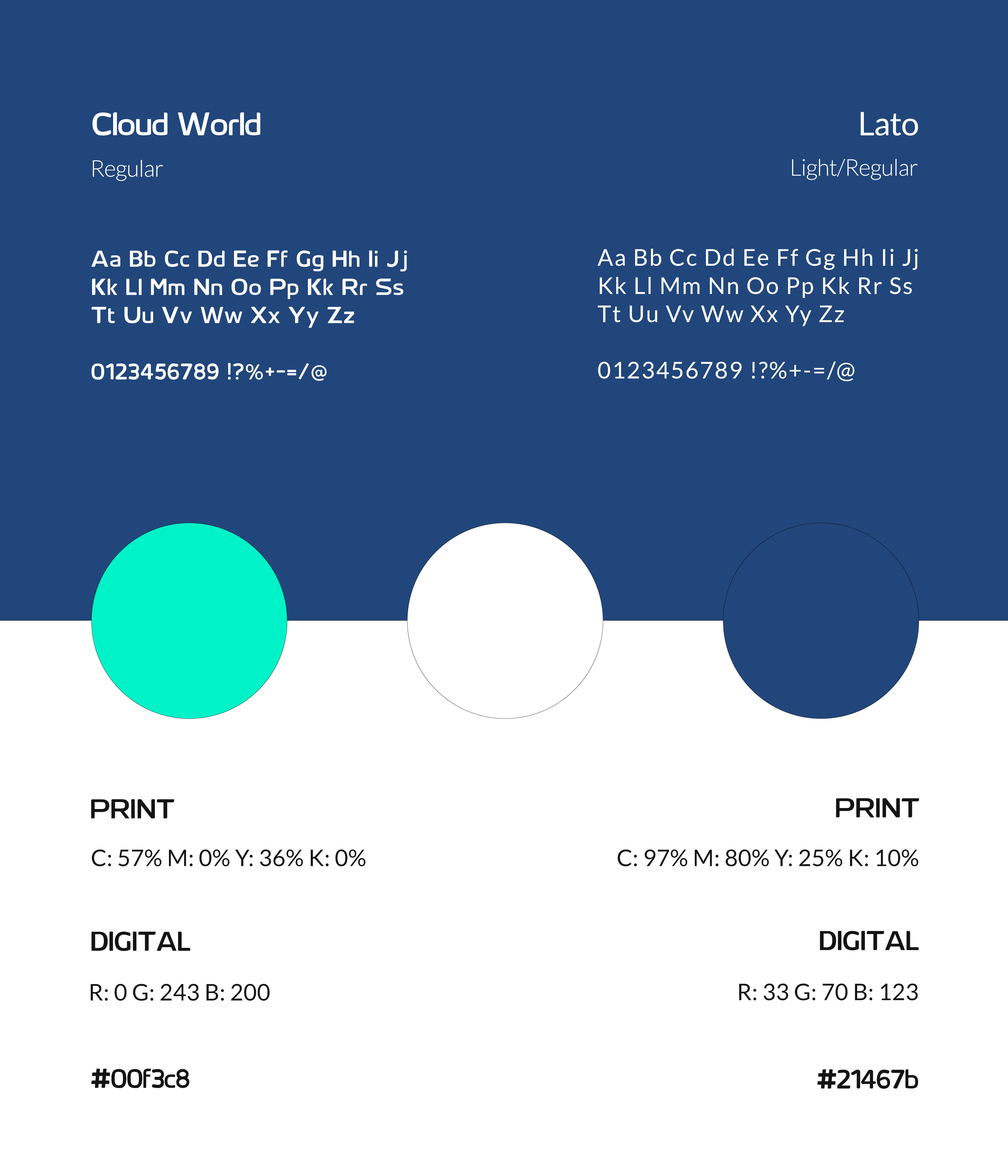
The carefully chosen fonts, “Cloud World” and “Lato,” contribute to the brand’s overall identity.


“Cloud World” adds a futuristic touch, resonating with the tech-driven aspect of the app.
“Lato” complements this with its clean and modern style, enhancing readability and ensuring a professional aesthetic.

Color Palette

The color palette, featuring pristine white #ffffff, deep blue #21467b, and vibrant green #00f3c8, captured the essence of IMTIRAS’ commitment to innovation and healthcare.

The seamless gradient transition between blue and green adds a dynamic touch, signifying the fluid integration of technology and healthcare.

Logo Variations

The logo variations, each with its unique strengths, collectively contribute to a cohesive and adaptable visual identity for IMTIRAS.

1- Primary Horizontal Logo:
This version, with its elongated format, serves as the cornerstone of the brand, offering adaptability across a wide range of applications. Whether gracing website headers or enhancing promotional materials, the primary horizontal logo maintains the impactful design elements, underscoring IMTIRAS’s unwavering commitment to innovation and healthcare.


2- Secondary Vertical Logo:
Complementing the primary logo is a secondary vertical variation, providing a more compact and versatile option. This version excels in situations where a vertical orientation is preferred, ensuring consistent brand representation without compromising the distinctive features of the human silhouette and hidden ‘M’ and ‘S’ elements.


3- Logo Mark:
Featuring the human silhouette, the logo mark stands as a potent visual identifier for IMTIRAS. Particularly effective in smaller spaces, such as social media profiles or app icons, the logo mark reinforces brand recognition.

Applications and Collateral

Discover the Brand in Action!

Ready to Elevate Your Identity?

If you’re seeking to elevate your personal or business identity, our expertise in branding can help you craft a visual representation that truly reflects who you are. 

Contact Us

(+216) 24 383 957  contact@theshinycreatives.com